
Redesigning Klart with color

For the first version of Klart I just wanted the design to be really simple and on-point. No big images saying nothing or other bloat that would distract users from the purpose of each page. This was pretty obvious goals since what I wanted to do was to evaluate the idea, not make a top-class design.
Time flies and even if I got some nice words about the initial minimal design, I decided to step it up and add some color. It also felt like good timing because I just recently finished the design of Klart's new logo.
Getting feedback
Feedback is crucial for me when I make new stuff. Sometimes, things can be obvious for me but really confusing to others. To get feedback quickly I shared screenshots of the new design on Twitter, asking for input. Turns out that people answer and I got some great feedback, Thank you for that ❤️.
Landing page
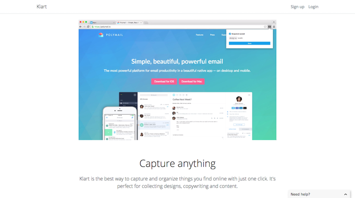
Enough words, this is what the landing page looked like before:
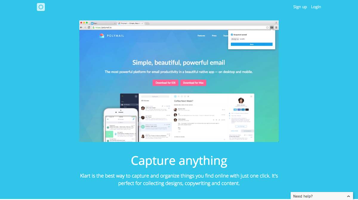
And this is after, with a dash of colors:
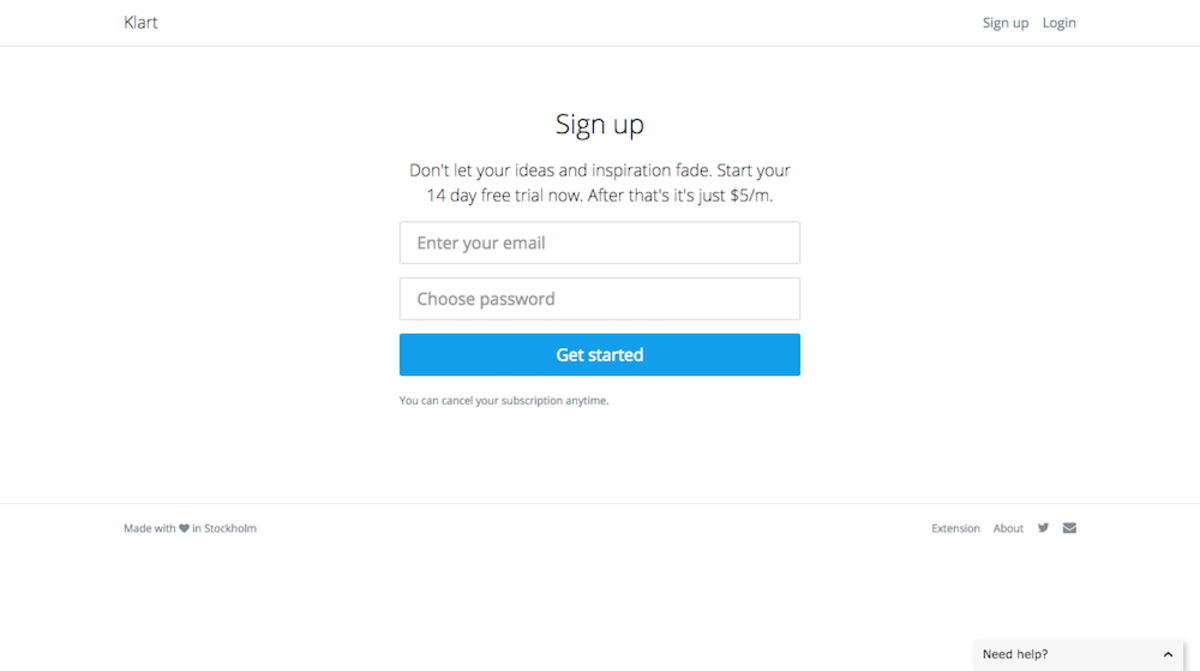
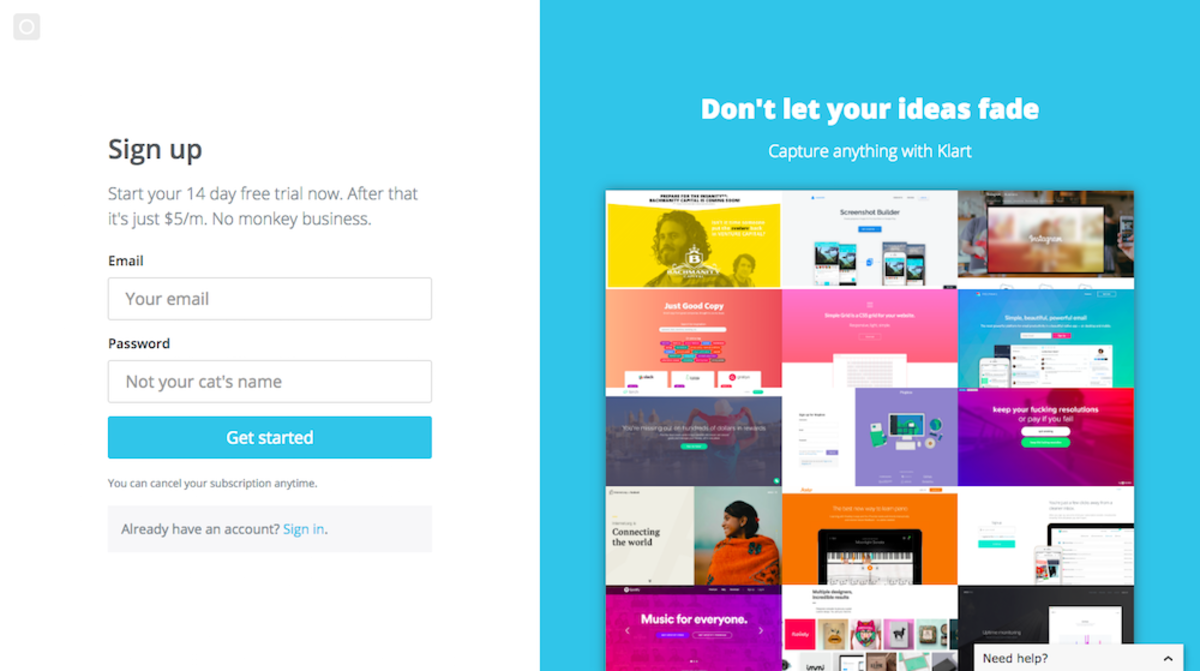
Signup page
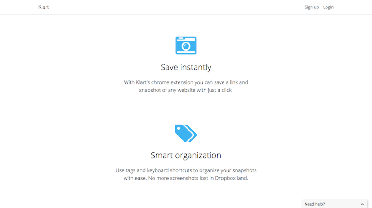
One of the biggest changes, apart from the navbar and landing page was made to the signup page where I decided to add a grid of snapshots taken with Klart. This is what it looked like before:
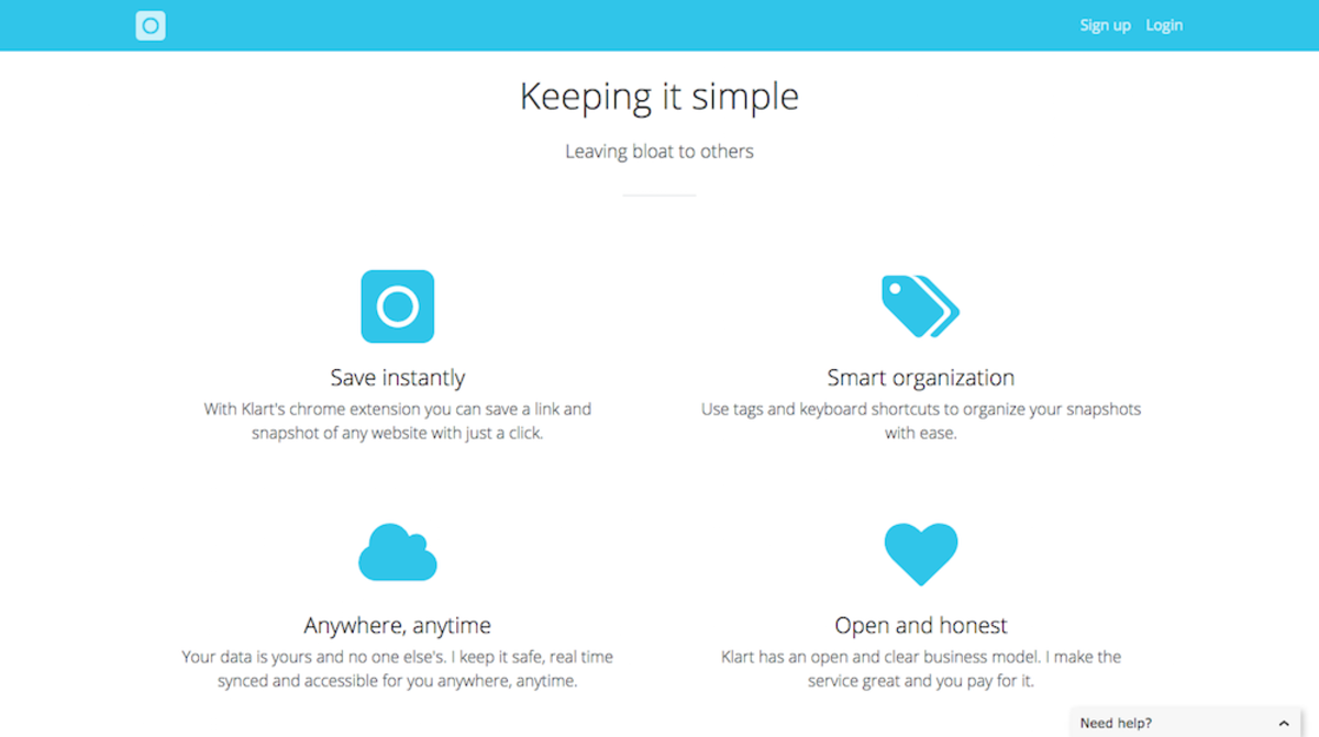
And this is after:
I also updated forms, colors and typography on the other pages, but I won't bother you too much with it here. Just check it out yourself at Klart.co 😊.