Navigation Wars: Top or Side?

I've made quite a few apps the past years. A social network for travel, local activities directory (kind of like Foursquare but for activivites), a word game, a screenshot and bookmarking tool, a design curation, data driven color palettes, a CRM for small businesses. Well. I think you get it. I've made some apps.
Recently when I was working on Wobaka, a CRM for indie makers and small businesses, I encountered what I often do. The holy choice between putting the navigation on top or at the side (or even at the bottom, or the right, if you're the adventurous type).
I was a few months into the project with a working layout and navigation at the top. This is usually the case because that's a defualt for the landing page and then I just customize it slighly for when the user is logged in. But something just didn't feel right. And I thought, this time, I'll give it some extra thought. And why not share it with you :).
Top navigation: The good, the bad and the ugly
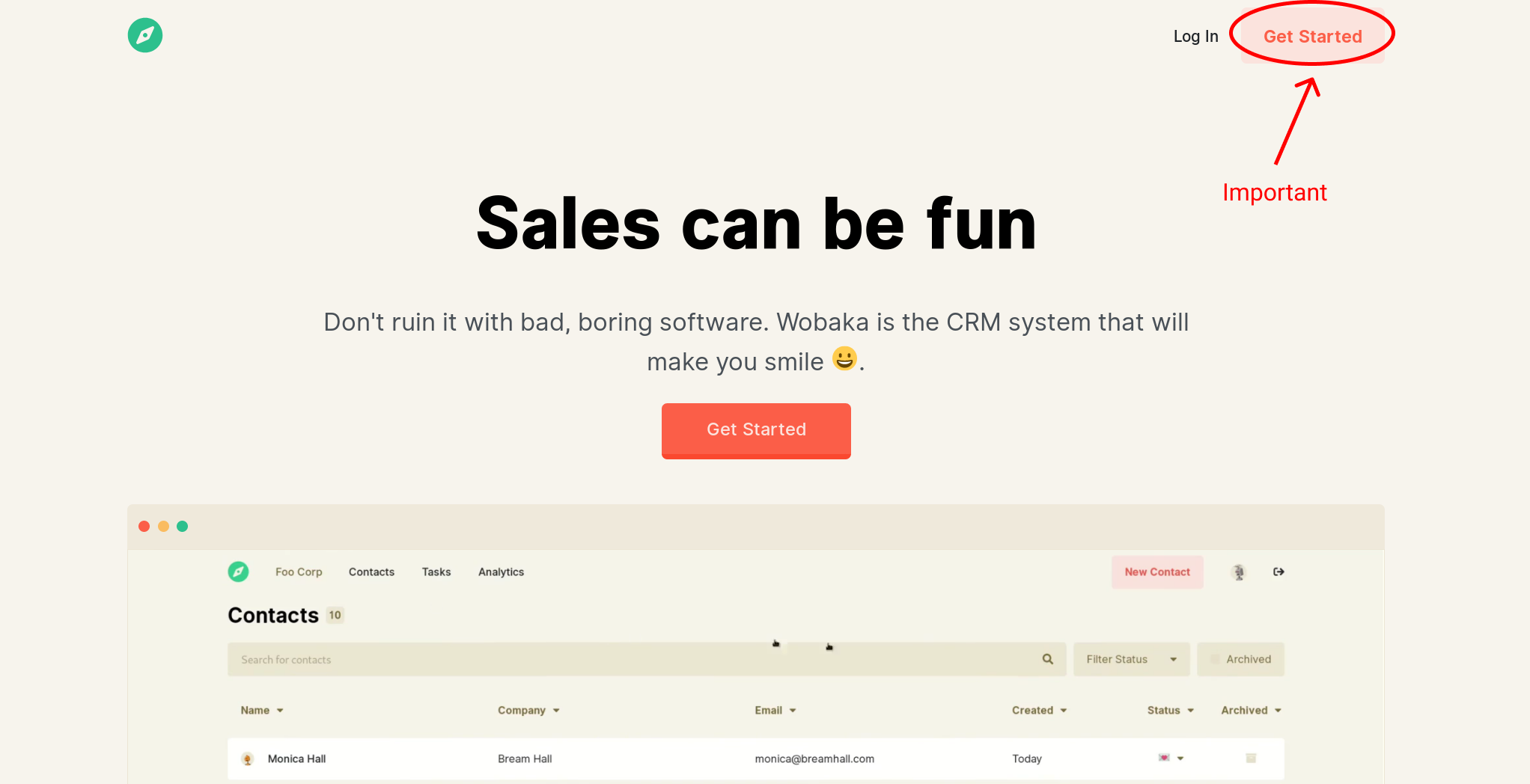
Having the navigation at the top works really great when you have a few interactive choices and want the user to focus on the content appearing on the screen. There's also the top navigation's evil twin, fixed top bar navigation which works great when you have some important action there. Like signing up for an app. You know, like this:
There's also a good case for top navigation if you plan to have advanced page specific navigation or controls like segmenting and filter options like this:
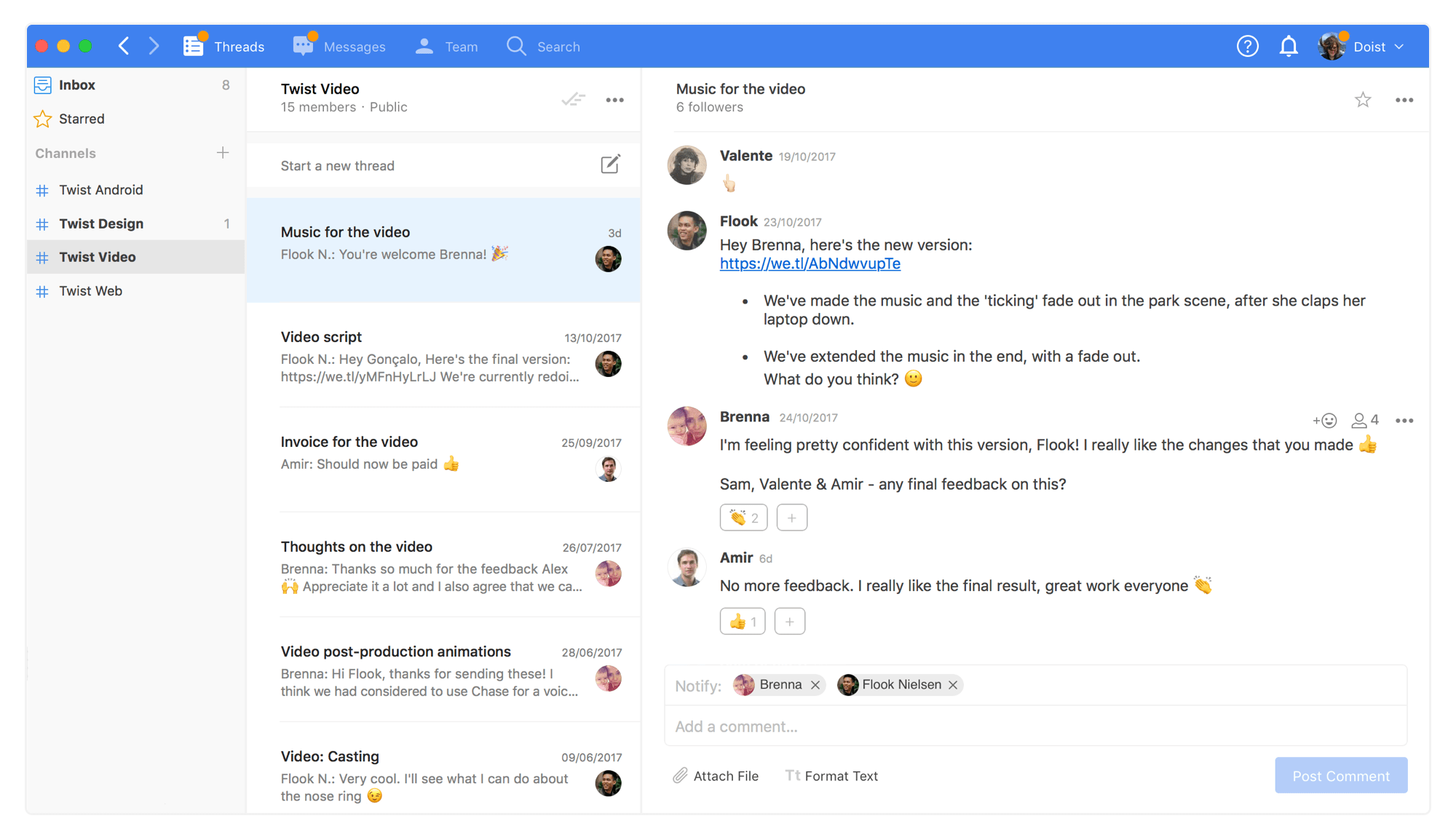
Here it really makes sense to put general navigation at the top and have the specific navigation to the side. The reverse would be... kind of weird? Or would it?

Ok so that works too. We can conclude that it's all about the elements in the navigation. Don't put too much in the top nav. More? well, let's forget about having extensive page specific controls and think about screen utilization. Starting with numbers. Given a navigation item height of 20 pixels and a width of 100 pixels. Roughly we can fit five times as many items when we stack them vertically. This isn't completely fair though since, you know, widescreen. But even then, you'll get at least double the space having navigation at the side. And we haven't even mentioned what happens when you start narrowing that browser window and your top nav will explode (or morph into a hamburger 🍔).
Sidenav all the things
With a sidenav you can have multiple sections and unnest stuff you would put in a dropdown if it were at the top. Sure, we do lose some horizontal space (around 200 pixels, give or take). But let's admit we all do max-width: 1600px or something anyway. Because no one likes content spanning the edges of the screen. So let's use that space for something instead of wasting it.
Often times, sidenav simply makes more sense. We have extra space with wide screens, so let's use it. On mobile it makes even more sense to stack vertically, as we do with the god old hamburger menu (we all curse it but still do it, admit!).
But don't use it if you have a lot of page specific navigation, as mentioned above. Then it'll look kind of weird and you're probably better of with top navigation. Or does it?
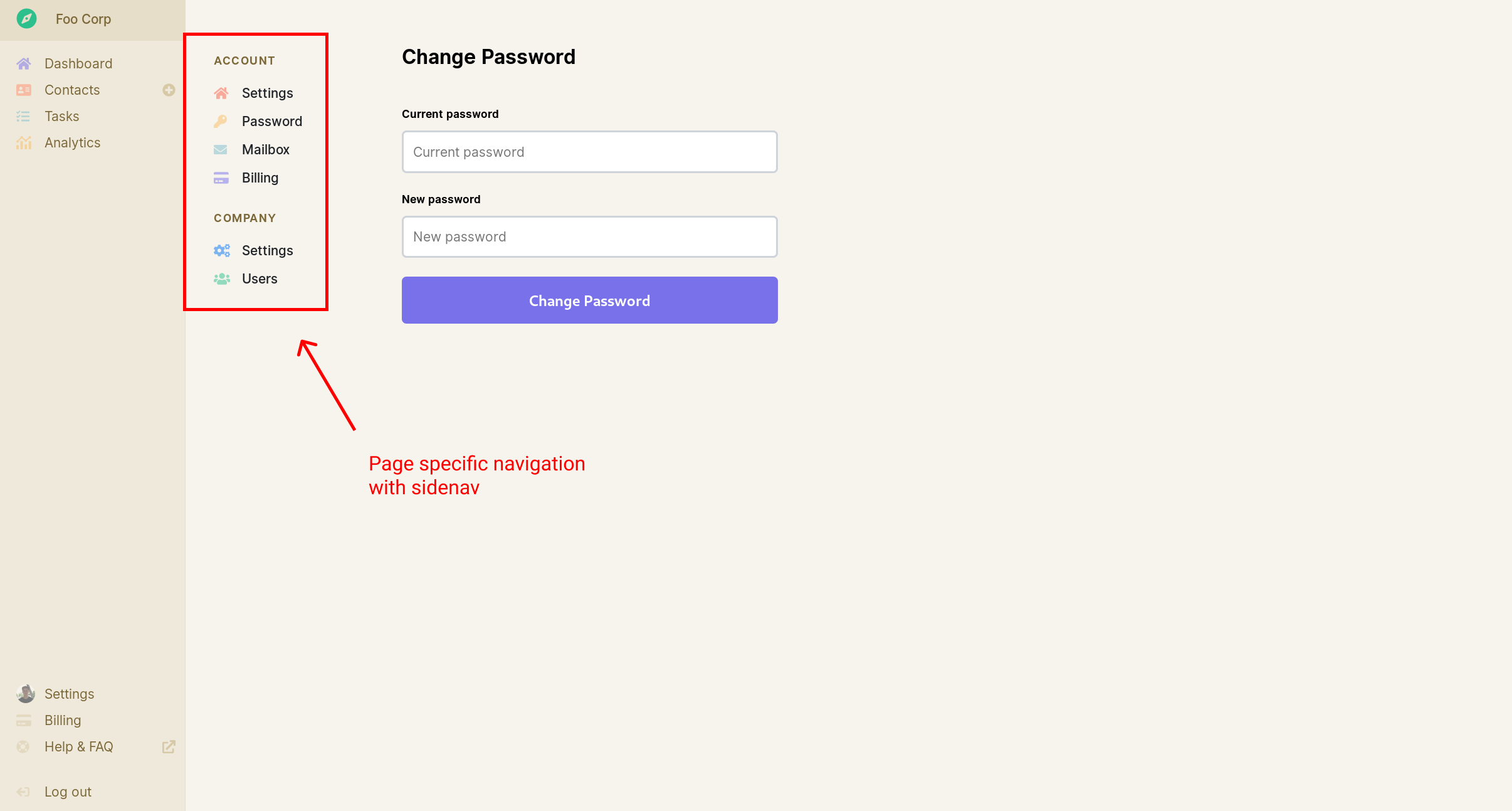
Seems to me like this is working too. But only when that page specific navigation is very simple, like here.
So, what to do?
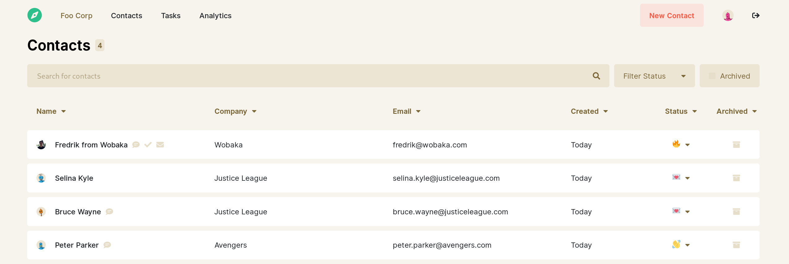
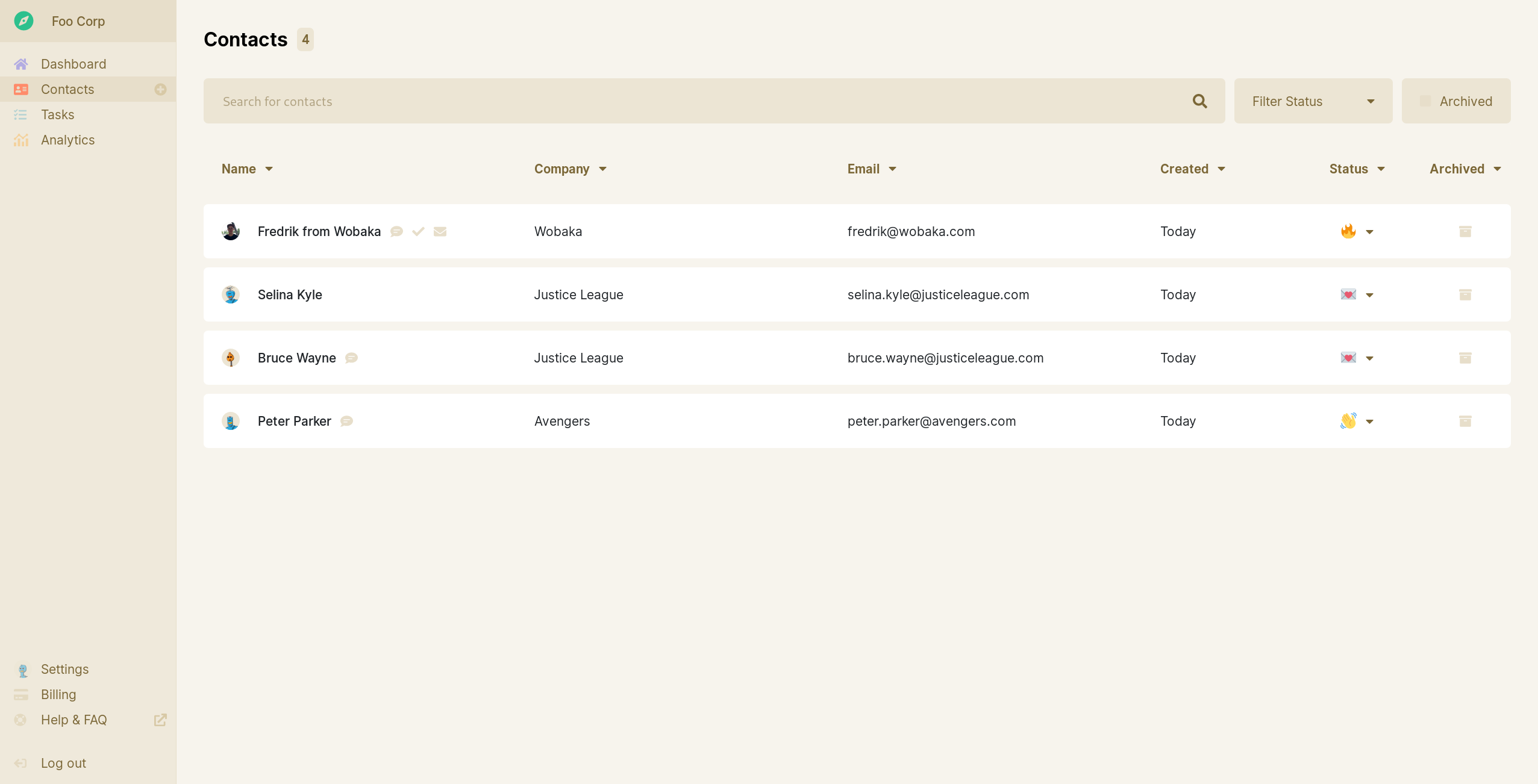
For Wobaka I eventually decided to go with a sidenav. And I believe this article wouldn't be complete without comparing the two:
From top navigation
To side navigation
Which one do you prefer?
I usually start with a top navigation and eventually move to having it on the side instead. Maybe I should start putting it on the side from the start. But only when I know I won't need some advanced page specific navigation.
Anyway, I like to talk about this stuff. Let me know what you think on Twitter @drikerf.
And if you're looking for a small business CRM that you'll actually enjoy using. Support an indie maker and give Wobaka.com a go 🤗!

