One Year Of Design 2017

After over a year of collecting designs with Klart for Pixels I thought it would be fun to visualize everything in some way. I really wanted to display all the designs together so I built One Year Of Design ✨ where I show everything in one big grid. If you're interested in how I built it, keep reading. If you just want to check it out, it's here.
From idea to Product Hunt in a week
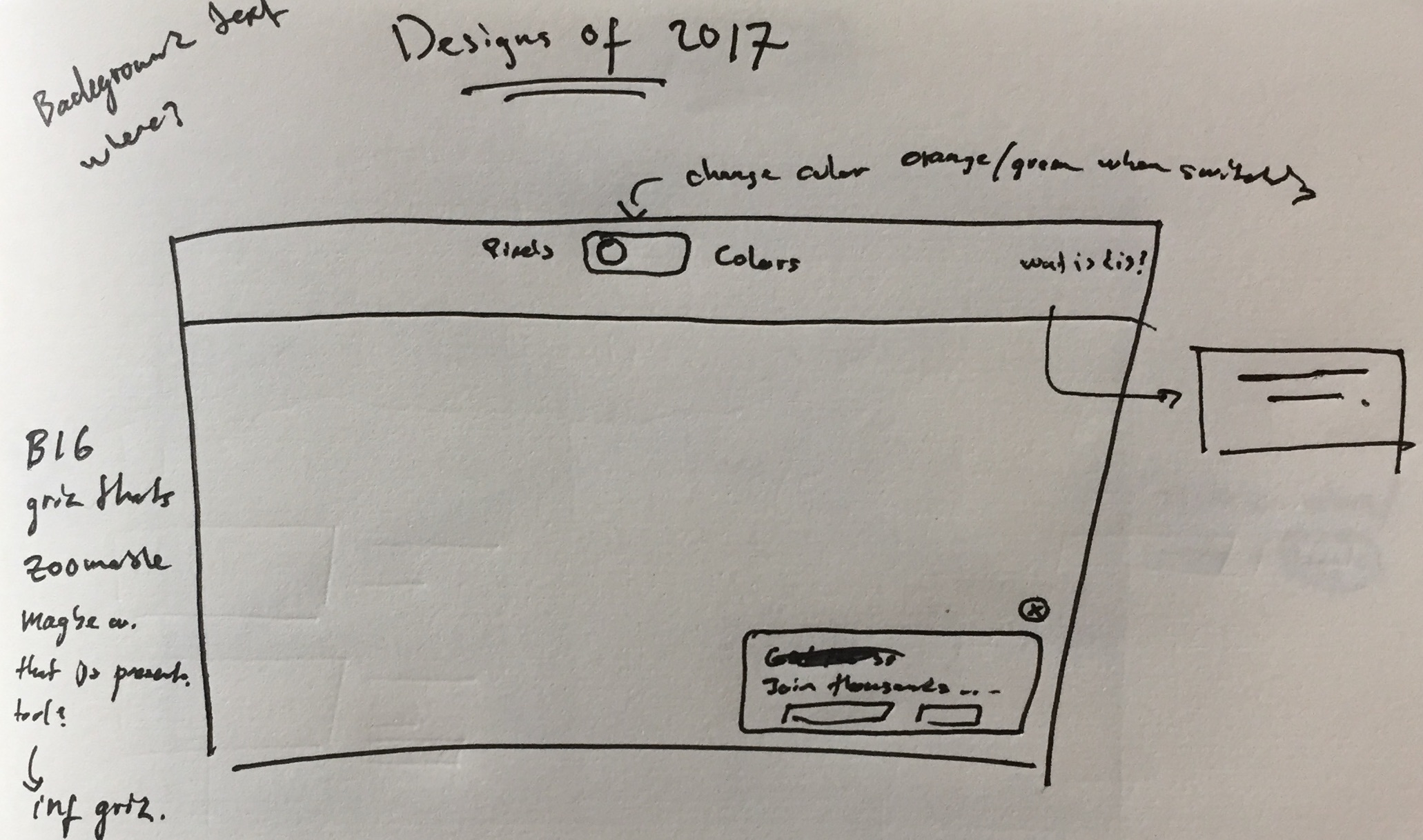
Sitting in a freezing coffeeshop (yes, the A/C was hard at work ☃️) in central Bangkok after two weeks of kiteboarding in Vietnam, my initial idea was to make some kind of infographic on the top 10 or so designs from Pixels' user data. But after some sketches I realized it would be more fun to make a big visualization of everything where you could zoom in on designs you like. Here's a quick sketch that I started out with:
About a week later I had a final version live and featured on Product Hunt. Let me take you through it 😊.
Start making
I like to move onto coding as fast as possible since I've had trouble staying in a design loop, where I would just iterate and iterate without really getting anywhere. So I just made this quick mockup and then moved on ⚡️.
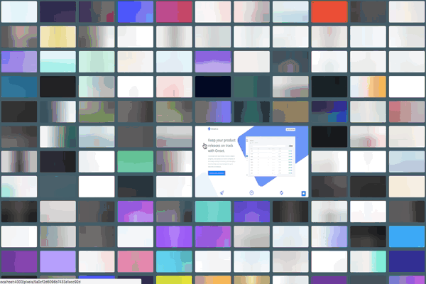
First version
The first layout was really simple. Using the oh-so-awesome CSS flexbox I was able to make a responsive layout with just a couple of lines of code. It had some issues though. One of them was that I used a CSS scale transition on hover to make images larger. An effect of this is that the scaled image would cover surrounding images and thus making them unavailable for zooming. This is because scale doesn't really expand the box, it just ... scales it 🙄. Another was that scaled images overflowed their parent container on the top/left/bottom/right sides. The latter problem was easily solved by setting the transform-origin property depending on position. The first one was a bit more difficult. One possible solution was to resize the element instead of scaling it. This way it would actually take up the space it needed, but surrounding elements would move. Anyway, this was the first layout:
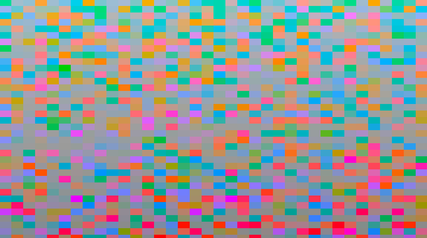
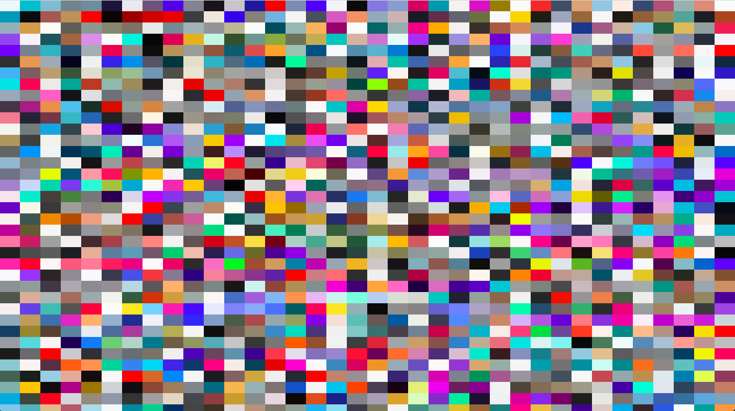
Scaling or resizing
Despite the potential of moving elements around like crazy, I decided to try resizing. I thought it would be different and kind of cool (some people didn't aggree 😜). I gave it a go using D3 JS (for the first time) and CSS grid (also first time). It was quite an experience but eventually I ended up with a working solution. This is what it looked like:
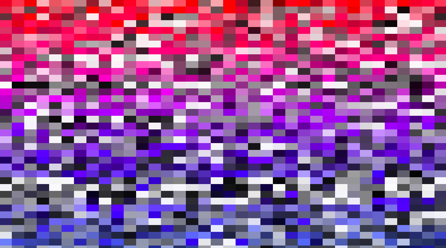
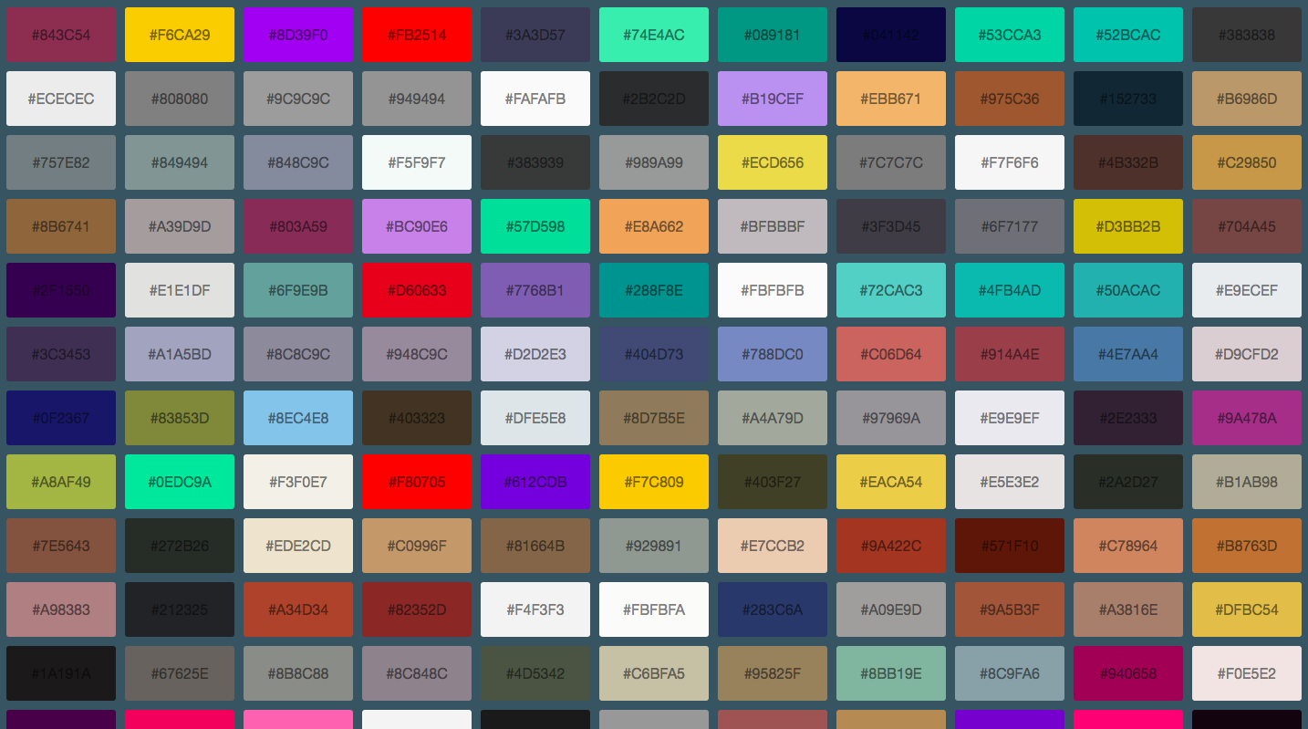
Next step was to make something from all the colors I've extracted for my data-driven color collection Colors 🤓.
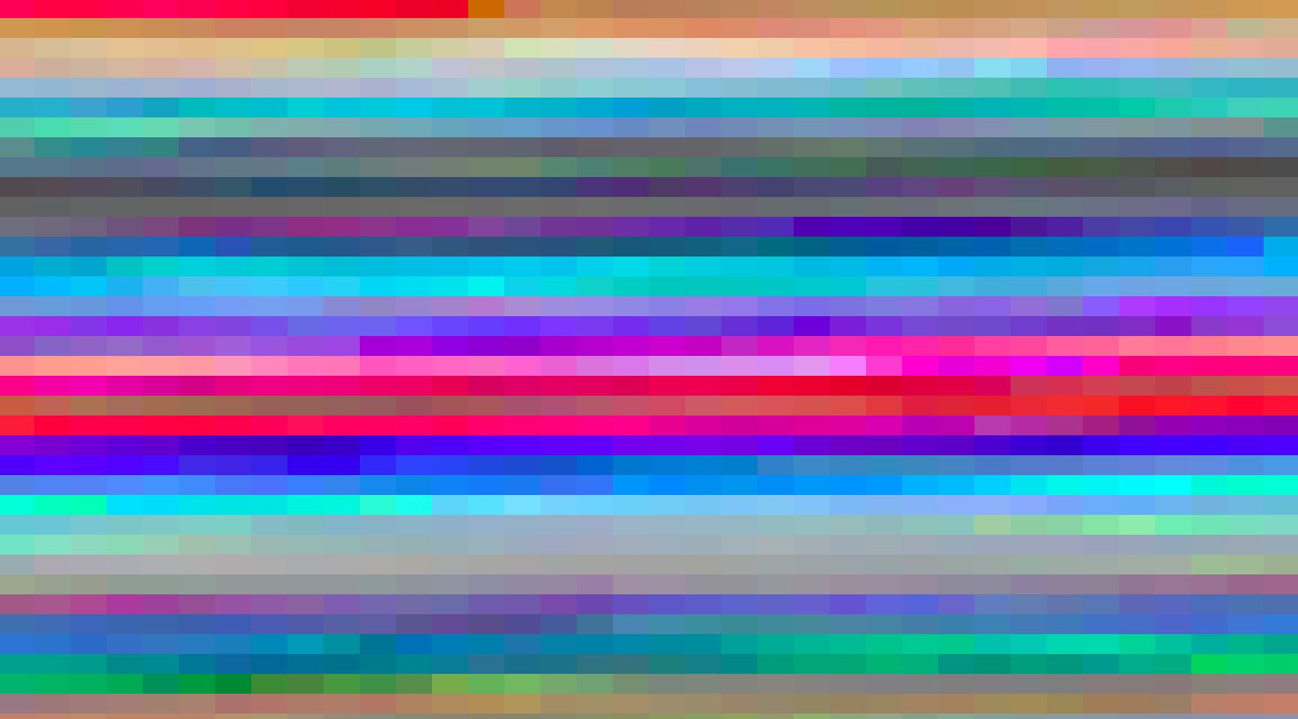
Sorting colors
Sorting things is easy, but not when you have thousands of colors that you want to present in a browser. Still, I though it would be cool and tried some different sorting approaches like luminance, hue and clustering based on min-distance algorithm. Pretty quickly I kind of realized that I couldn't sort them in the browser, at least not using clustering since it was basically O(N^2) timecomplexity with N > 6000 so it took a while. To move on, I decided to just leave them next to the other colors in their respective palettes. Which turned out to be quite useful when searching for color combos 👏. This is the results for some of the sorting algorithms:
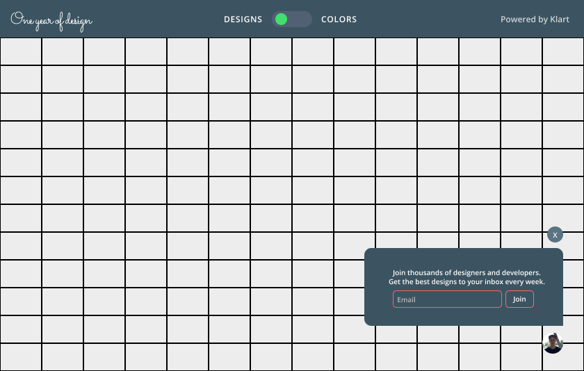
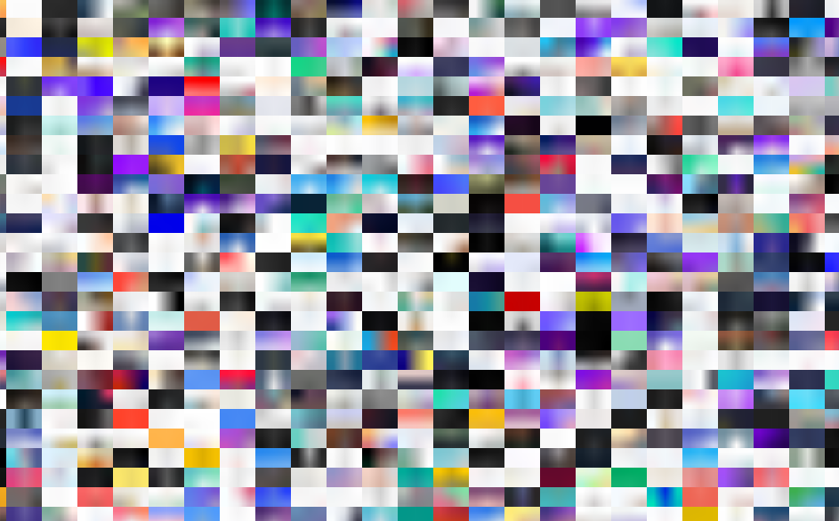
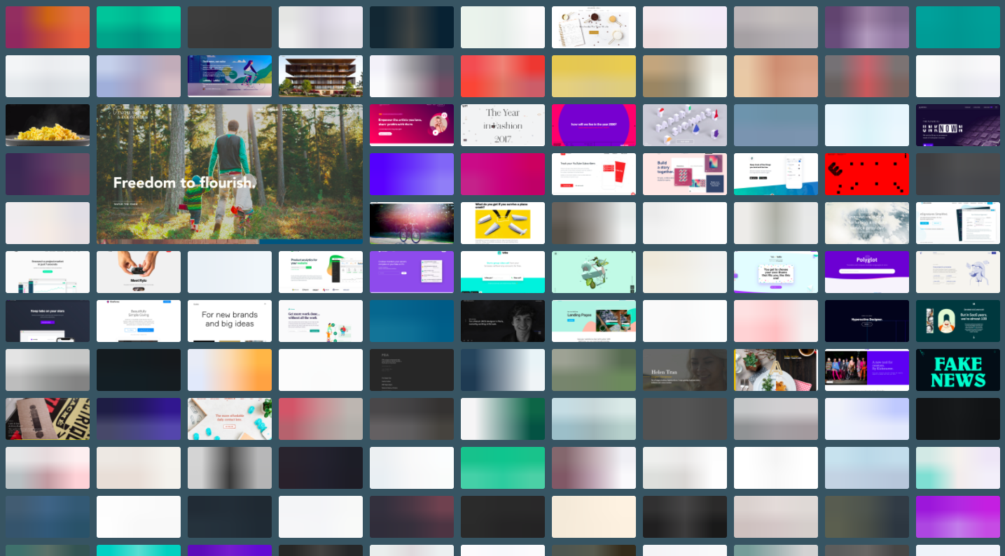
Final version
After loads of coffee ☕️ and bubble tea 🍃, this is what I ended up with (designs are revealed when zoomed/hovered or clicked):
Critique
This was a super fun experiment. But I have to admit, the UI is not the best. I still like it for easily exploring designs in a fun way and I really like it for finding color combinations. This is also what I aimed for, a fun and complementary showcase for Pixels. The idea was never to make a boring and easily navigated site. I aimed for crazy, and considering the comments, I guess I succeeded on that at least 😅.
I'm @drikerf on Twitter if you'd like to chat 😊.