Making Products User-Friendly


I've been building Klart.co — a bookmarking service for designers that saves a link and screenshot of anything with just a click for about a year and a half now. This is not my first project and I thought I knew a few things about UI/UX/Design before. Working on Klart has proved me wrong. I knew nothing 😜 .
After using Klart to save hundreds of beautiful designs and user feedback I spent some time in October redesigning Klart to be more user friendly. I'll write about some of the things in this post and I hope you'll enjoy it.
Design you think is friendly vs friendly design
I started building Klart for myself and I'm still a power-user saving articles, designs for Pixels, travel research and pretty much anything, every day, on it.
A problem or maybe a misconception with "scratching your own itch" is that you don't have to gather user feedback. You can just use it yourself right? Well that turned out to be far from the truth. The problem with this idea is that it assumes your users know how you think or thinks very similar to you. But just because you understand your UI doesn't mean that your users will. The most powerful tool designers have here is to use the concept of familiarity. This is how:
Look at what products your (future) users use today and make it easy for them to adopt your product. Don't be smart. Smart designs are loved by the makers but might not be understood by users. Familiar designs are not noticed, they just work, appreciated in silence. That's what you're aiming for. I've learned this the hard way with both Pixels and Klart.
Design that scales
One thing I often miss when creating mockups without real data is how a design might actually scale with your users. When users keep adding more content like boards and snaps, how will it be manageable? For example, the first side bar navigation for Klart was a column of icons with initials for each board. The problem here was that, while it looked good with a few boards, it became impossible to navigate already at 10+ boards. Luckily I have a lot of boards myself so I noticed it pretty early on.
Another important aspect of design that scales is how the interface will scale when more features are added. Since the first version of Klart I've added: tags, real-time sync, notes, archive, search, boards, sharing and collaboration. How can you make a design that will scale with future features? It's hard to predict everything that could happen, but it's worth to think about it. With Klart I had to redesign the app two times already to fit new functionality but now I think I can keep going for some time 🤷♂️ .
Keep it functional
Functional design beats good looks when you're introducing a new product. It's hard enough to sell your product's benefits to potential users, and if they don't understand how to use it, it'll be almost impossible.
For example, text is often better than icons. Text + icon is even better. With Klart I decided to trash the pretty board icons in favour for good old links with icons signalling if it's a shared board or not.
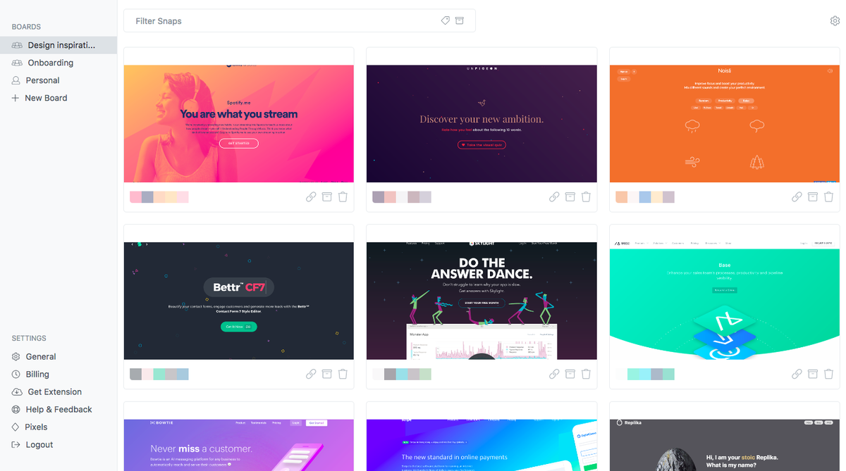
Hidden navigation
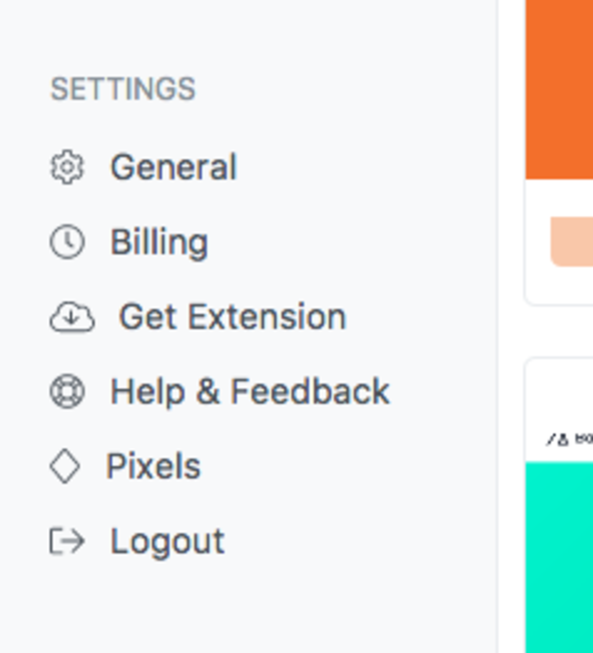
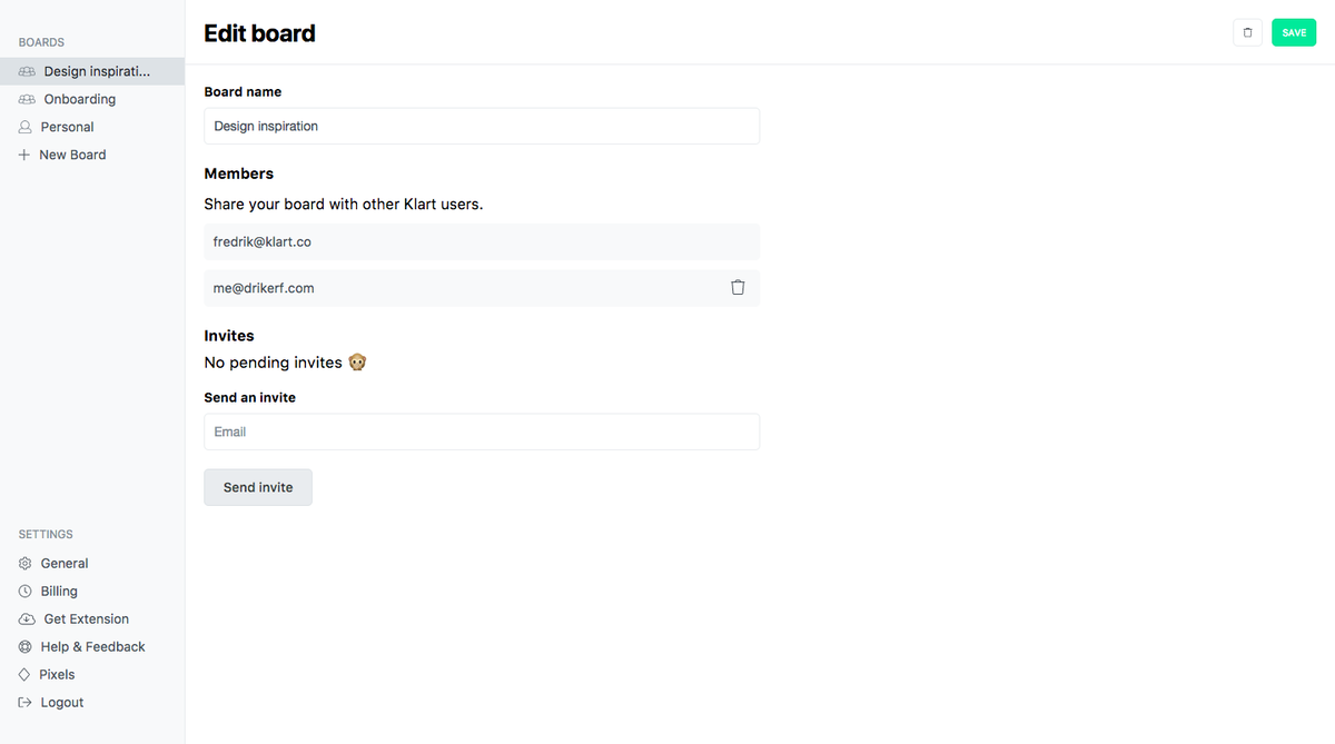
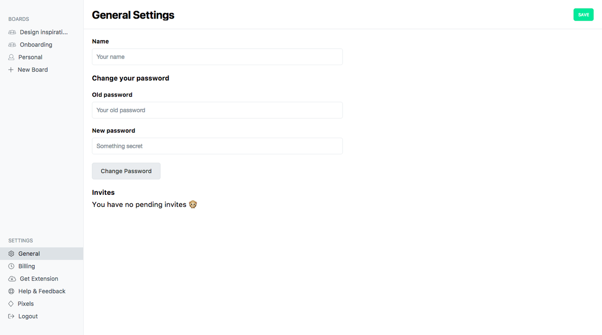
Hamburger menus and dropdowns are evil. Whenever you can, avoid them, especially on bigger screens since they're probably not needed. I had a dropdown for all user settings on Klart. People complained so I made a list of all links in the sidebar instead. Turned out that I had plenty of space to do this.
Consistency
For the first versions of Klart I designed every page almost independently like I thought it should look. I've come to realise that having a consistency between pages really helps the users to navigate (it also helps you make re-usable components). For instance, the save/edit button can always be on the same place. This will not give you as much flexibility as a designer but will be silently appreciated by your users 🙏 .
Responsiveness != mobile friendly
Just because your application is responsive doesn't mean that it's mobile friendly. If it's slow and cluttered with features no-one ever would use in a phone it's not friendly at all. Klart is a responsive web app, and I'm working on making it friendly.
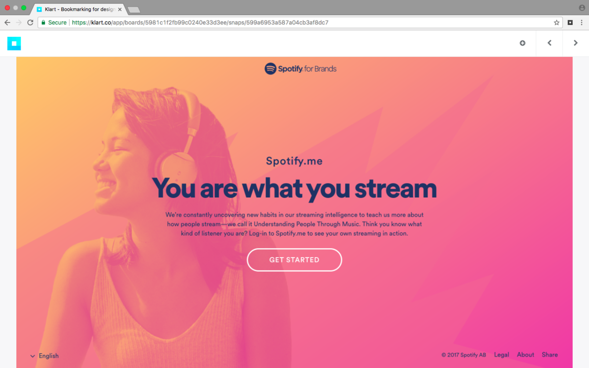
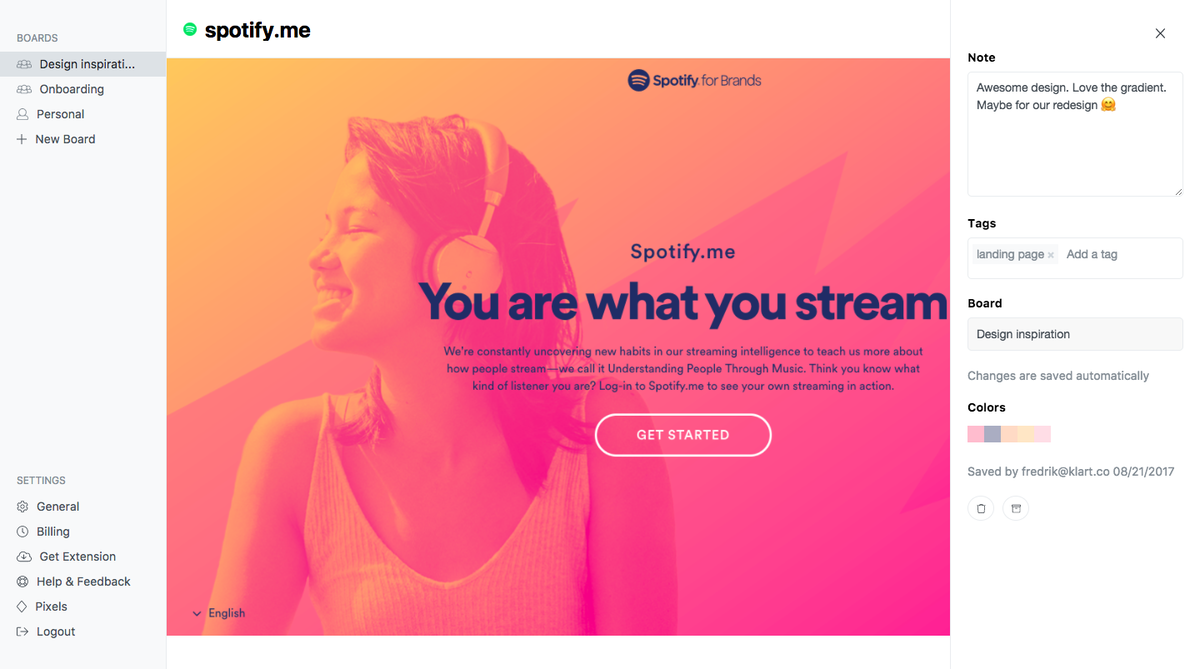
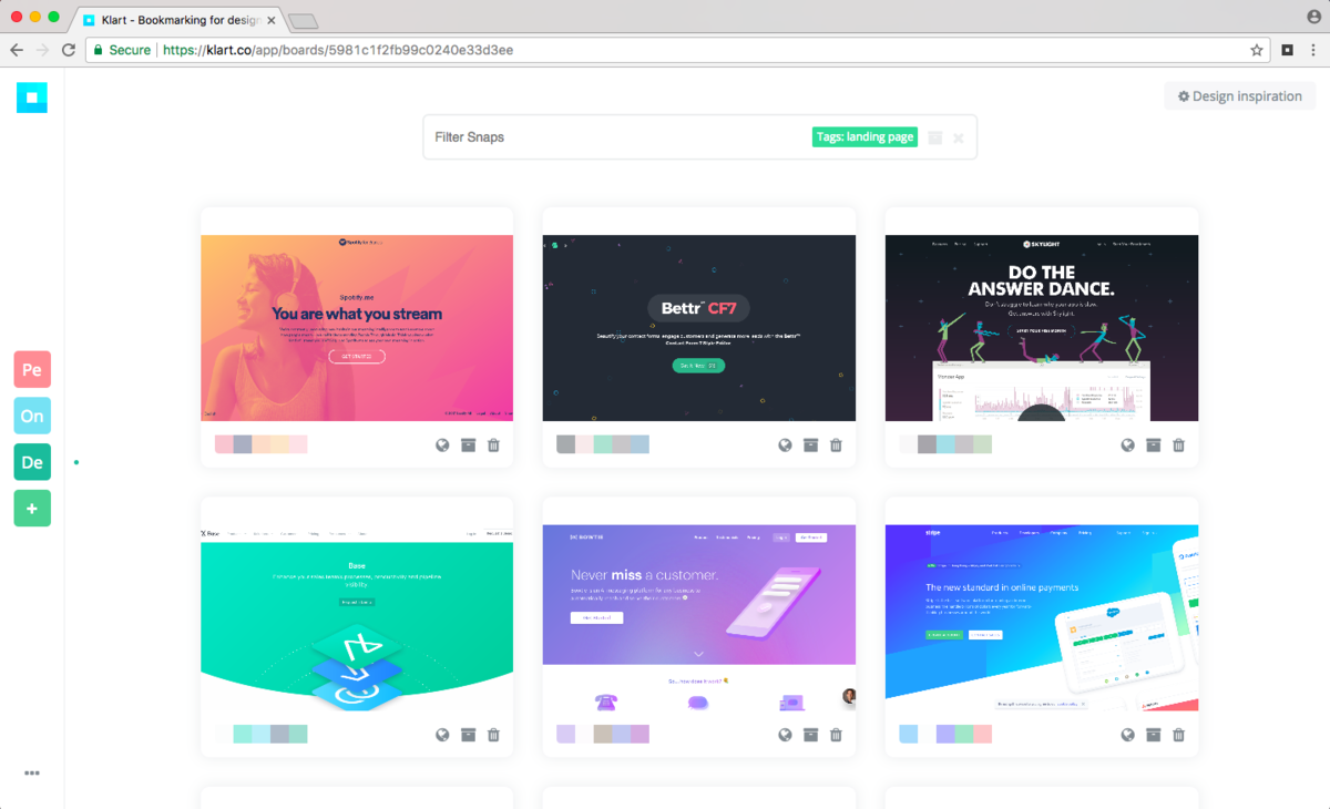
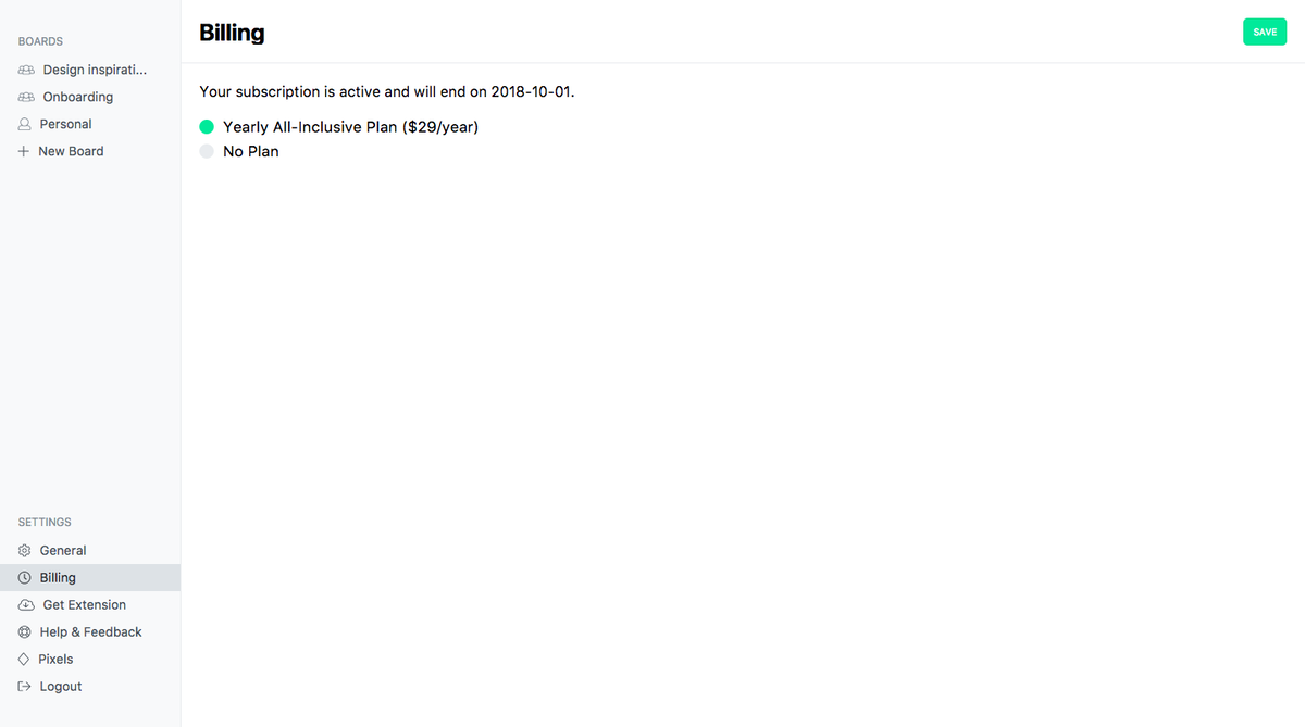
Klart's new design
This is what some of the pages on Klart looks like now 🤗


Looking forward with Klart
So far, users are liking the new design more and it seems like they understand how to use the app faster 😍 . Hopefully the design will scale with new features so I don't have to redo it too soon. Some things I'll work on design-wise the next weeks are:
- Scalable grid: users will be able to choose how big screenshots should be in the list-view. This makes sense when you have a lot of snaps or maybe boards with non-visual snaps.
- Mobile friendly: I will optimize the mobile mode to be slimmer, have less visuals and be easier to navigate.
These are lessons that I've learned when building Klart. I hope you can make use of some of them but don't forget that shipping something is always better than shipping nothing 🚢 .
Let me know what you think on Twitter @drikerf.