Context In Design


One of the best things about making something for yourself is that when you use something every day you will notice issues and make minor improvements all the time. Sometime you find these issues yourself and sometimes users mention them and you realize that, "Oh, yeah, this is a big problem.". This is about the latter.
Feedback is golden
I love getting feedback on Klart. It feels like I have superpowers when people tell me about how they feel about a certain design detail or functionality. This time, it was a minor detail, but it improved my workflow with Klart as a user vastly. It's also a good reminder that you cannot skip user feedback just because you're building something for yourself. Sometimes, when you use your own product every day, you might also miss usability issues for new users. Anyway, let's look at a nice little UI change that came from user feedback this December.
Minimalist design
I'm a big fan of minimalist design. I like to reduce buttons, text, number of colors, etc to bare minimum. I like things to be self-explanatory. Sadly when interfaces grow in complexity this is easier said than done and there is a big difference between a bloated UI, a minimal UI, and a friendly UI. The latter can still be clean and minimal though. Minimalist design != No Text/Context and minimalist design can also be very friendly. In fact, when done right, it's super friendly. It's about the idea, structure and feeling of your interface. Not just leaving things out.
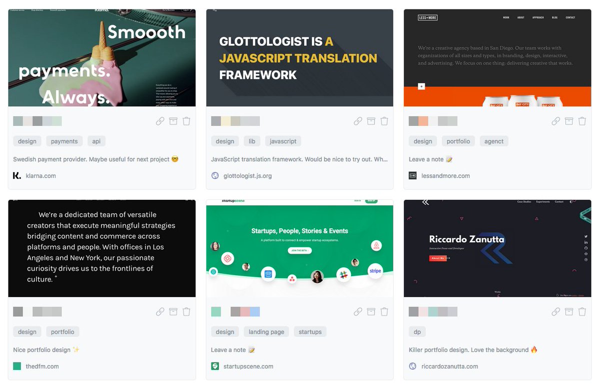
Let's look at an example on Klart. In the first screenshot, snaps on Klart only have colors palettes and few buttons attached to it. I thought it was great since the screenshot provided me with some context even if it was small. If I needed more info I could just click to go into the details view or visit the page directly.
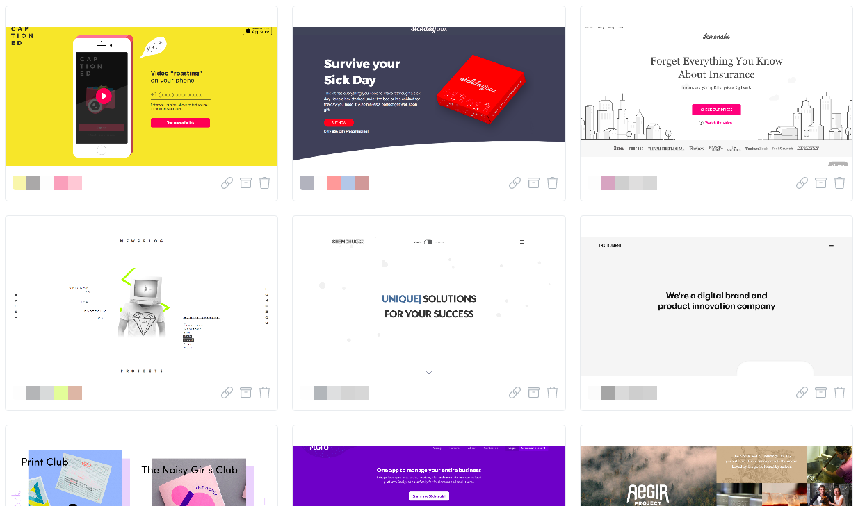
What's the problem with this? For example, I cannot see if there is a note attached to the snap. I also don't know what tags it has, so if I wanted to filter to see only snaps with similar tags, I'd have to either guess or go into detail and back. The problem would be even worse if I was completely new to the product. Did I find this issue myself? No, but I realized it was a problem when someone told me about it. So I decided to fix it 🤓.
Naivety rocks 🤘
When facing a problem I like to start a naive solution. Whether it's an algorithmic- or design related problem. It gives me a feeling of success to just draw something out. And often the naive solution is perfectly fine for both algorithms and design. For this problem, my naive solution was to just make the container bigger and add tags and notes to it. Let's see what that would look like.
Not so bad right? I was perfectly happy with this and from what I know, most people aggreed because I got some great feedback on it 🎉 .
Why it's better
With the new design I can see notes, tags and url directly in the list view. Because of this, my workflow has improved a lot. I spend very little time in the detail view since I get most context, except from timestamps in the list view. I only use the detail view when I need to see a bigger screenshot or when I want to change something.
Can this be made better? Of course, and it probably will in the future. But the point is that, providing more context and being naive is often a perfectly good solution, even if you're aiming for minimalism.
What do you think? I'd love to hear your thoughts on Twitter @drikerf. And if you need a great tool for bookmarks and screenshots. Try Klart, it's great 😀.