Designing Klart's New Logo
When first building Klart I was just making a chrome extension to save design inspiration I found online. I needed a simple tool to take pictures of websites and organize them. This meant that I didn't really need to spend time designing a nice logo for Klart. I just needed the tool.
Things has changed. It turned out that other people like Klart too 🎉. So rather than just hacking the tool for myself, I'm working on the next version of Klart with increased stability, speed and better UI. When doing this I thought that a new logo would be in place, since the first one was just a FontAwesome icon with color (which are great bases for logos btw 👍).
Now, I don't consider myself as a designer. I'm more of a avid learner and developer with a big interest in design, trying to learn whatever comes my way by making stuff. I thought I'd share the process of creating Klart's new logo with you. Maybe it could be of interest for other developers or even designers.
The first logo was a retro camera, it looked like this:

Since Klart is about capturing stuff online, I initially thought that I should stick with something like a camera as logo. Since the logo would be used in the Chrome Extension I had to take into account that it should look good and be recognizable there too. I also aimed to go for a minimalistic, flat design.
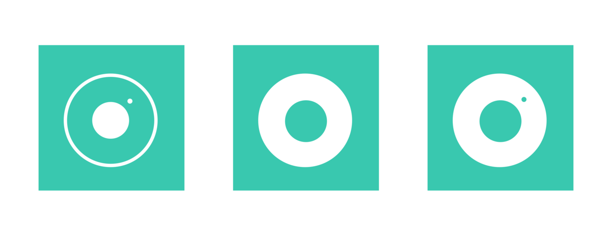
This is the first sketches I came up with (I guess I was a bit inspired by Instagram?).
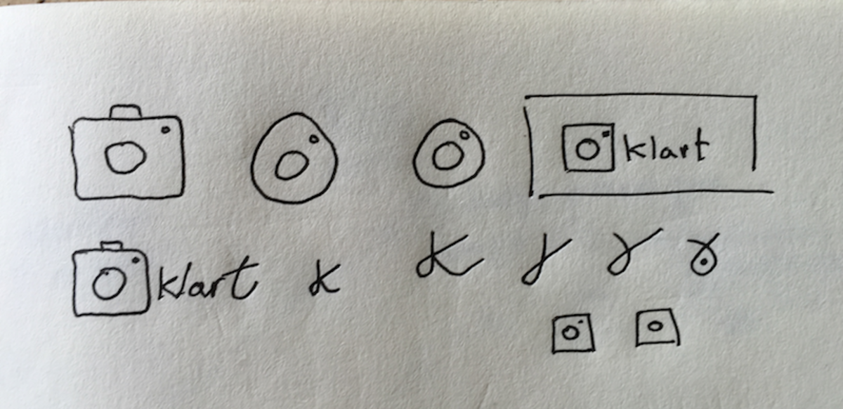
I use sketch for pretty much all my work, I haven't yet found anything I wanted but couldn't do with it. Here are the first iterations on the logo:
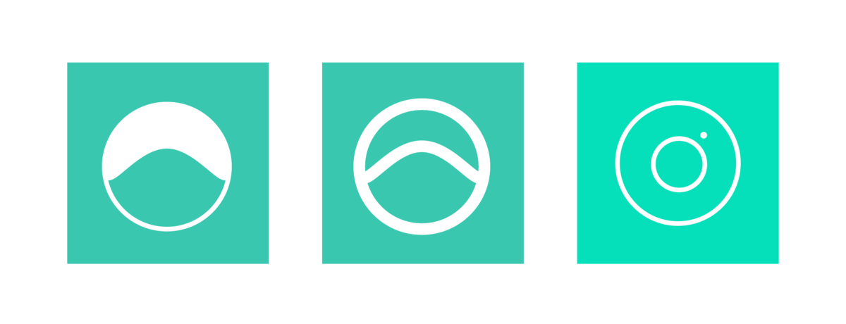
I experimented some more and came up with the following. The curve is representing a clear sky behind a hill (Klart means clear in Swedish).
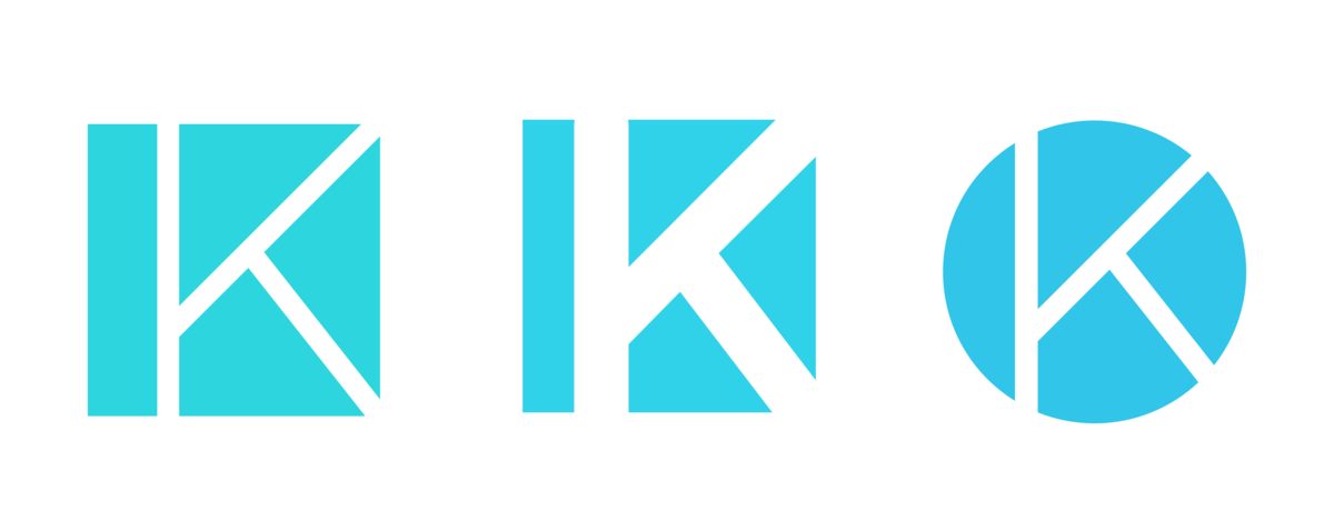
I wasn't quite happy with it, but I leaned towards the two circles (representing a camera). I did think it was pretty similar to Instagram's new logo, and wanted something a bit more original. I made some experiements with the letter K instead. I liked it and tried some different styles including squares, circles and different font-weight. I made the K larger so that it blended with the background. It turned out to be a favorite for me.
I gave it a day and looked at it again and decided to stick with the circle. After some dilemma around letter-spacing on the text, this is what I finally came up with, and decided to name Klart's new logo 🎉.
What do you think? Let me know on Twitter @drikerf 🤓.
Update
It turned out I still wasn't quite happy with it. Eventually I ended up with this 😊
